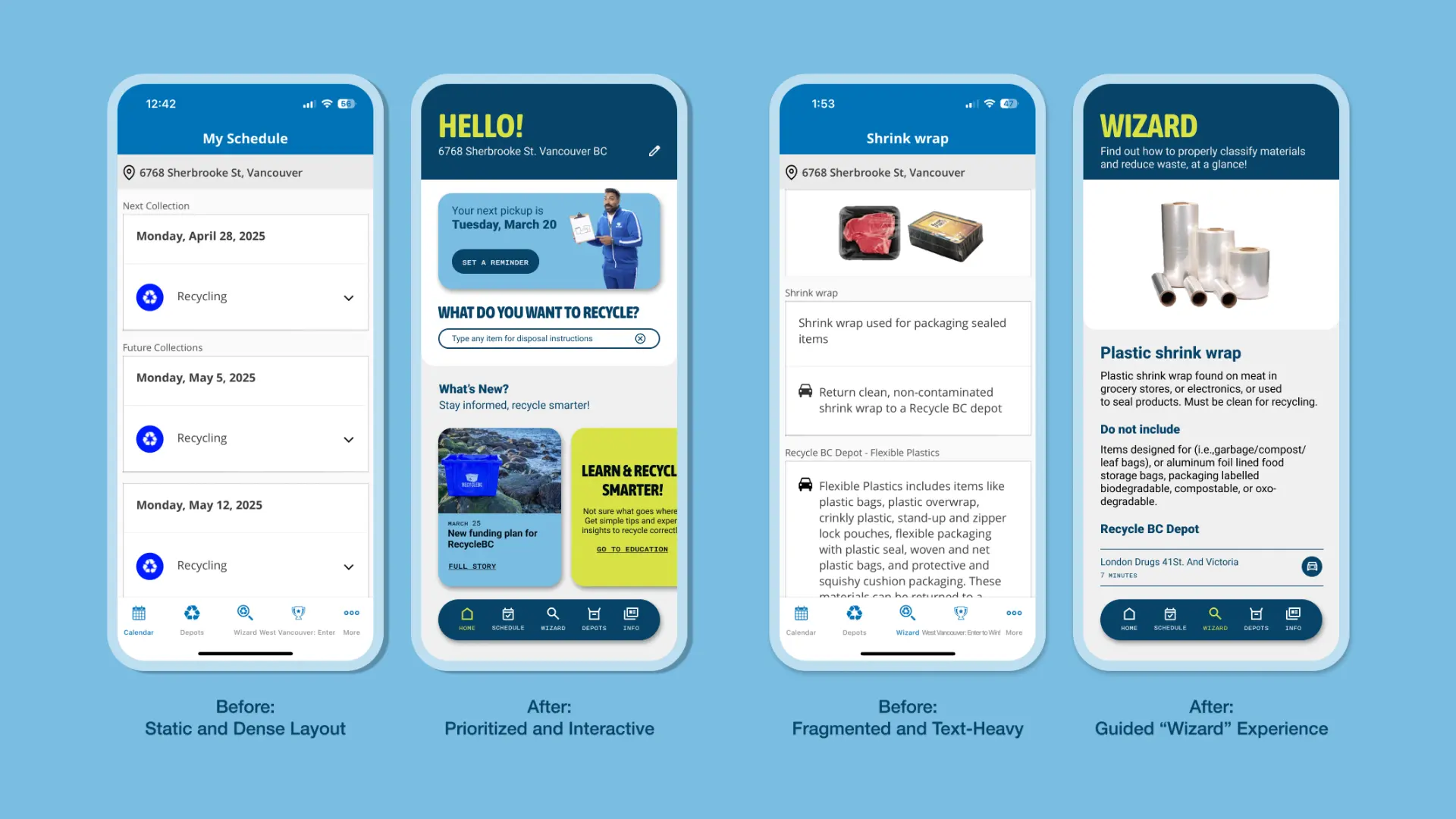
The original app made key actions hard to complete. Pickup dates were buried in cluttered layouts, and depot locations were difficult to navigate. Without guidance or reminders, many users abandoned the app after initial use.
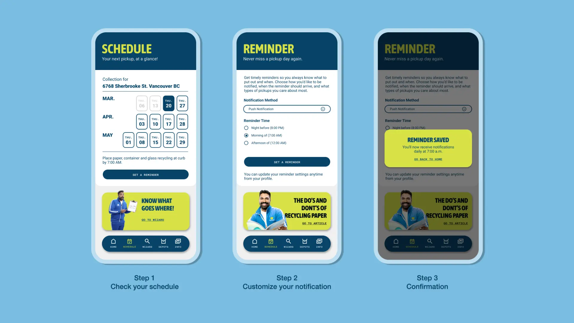
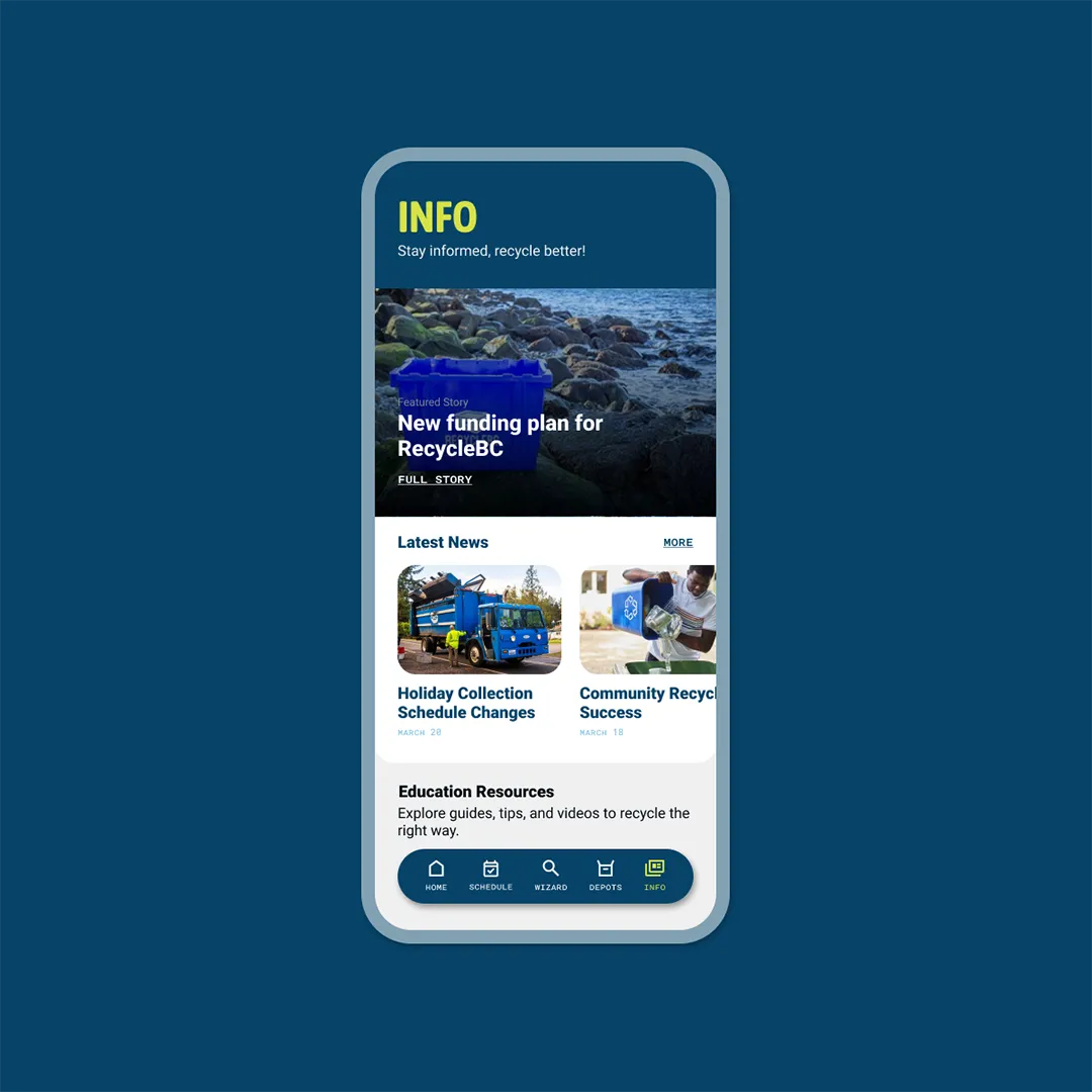
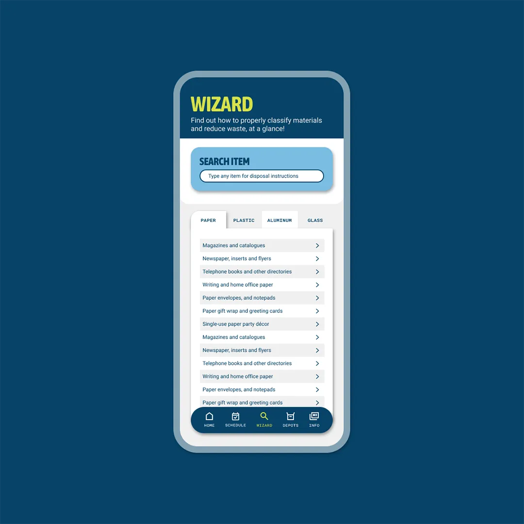
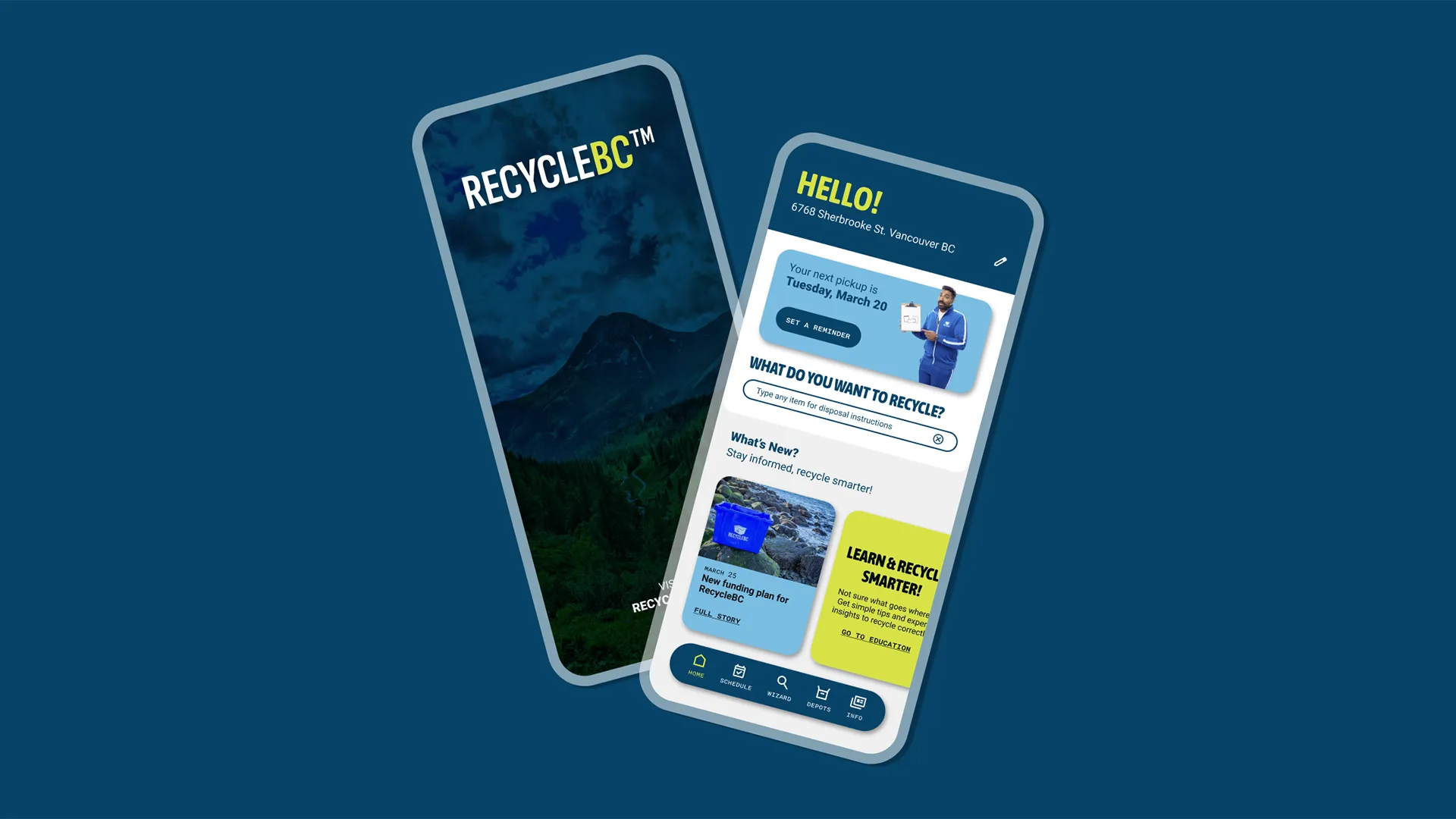
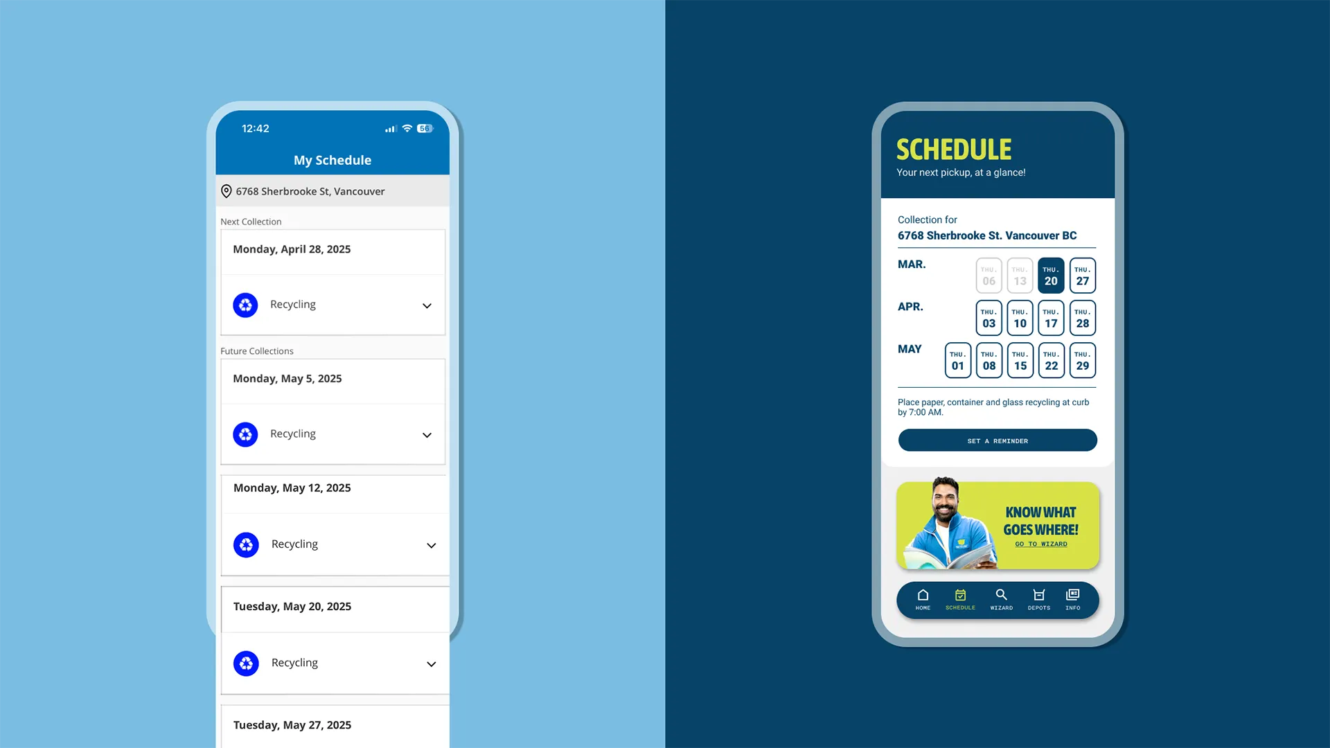
The redesign introduced better visual hierarchy and reorganized content like the calendar and depot map for faster access. A new reminder feature was added based on user needs, and motion design helped make the experience feel more intuitive and pleasant.